
The ClickView redesign
Overview
My role
Lead product designer end-to-end
Platform
Responsive web
Mobile app
Year
2019 - 2021
The redesign of ClickView allowed design and technical debt to be left behind. The project aimed to modernise the platform by bringing in a new layout, design system, and updated features that were all built ontop of a new web app stack. ClickView Lite set the new bar for quality within the company and unlocked more opportunities to support teachers with video in the classroom.
How is video used in the classroom?
The research objective was to first understand the needs of the Primary school market. We set out to observe the context of the Primary classroom, specifically to learn how video is used in a teacher’s day-to-day. This unearthed key pain points in both the classroom and with ClickView.
How we collected user data:
Surveys
1 on 1 interviews
1 workshop
2 classrooms observed
Access to Education Victoria’s survey and focus group data

Interviews

Classroom Observation


Insights
What were the users saying about ClickView?

Overwhelming
ClickView had a large video library where teachers would sift through and search for relevant content. There were often features people had no idea existed and required training because it wasn’t intuitive.

Dated
People found the platform had “too much going on”. The platform was visually dated and out of touch with modern websites like YouTube and Netflix.

Results were irrelevant
Teachers expected to see relevant and personalised content for their students that align to the curriculum. Meanwhile giving students access to the platform was a laborious and difficult process for Teachers.
So, how might we make ClickView accessible, fresh, and relevant without leaving behind popular features?

Curate our videos and resources
Content on the new website should be categorised by subject and topics. We should align it to curriculum verbiage, popular search terms and content should be filterable by student level.

Less is more
Create a new design system, update the brand and have highly curated visuals that are age appropriate.

Search first, Sign-in after
The new website should optimise for searching first as that is the natural first step people take when visiting the website. We will work towards a ‘search first, sign in after’ user flow for both teachers and students.
Low-fidelity


Mid-fidelity


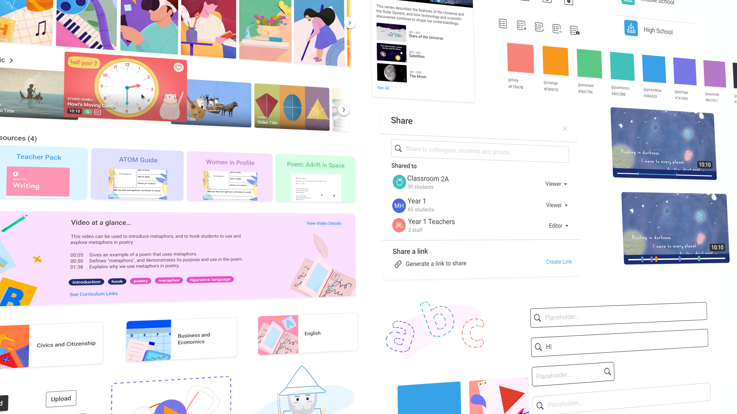
Design system
·
Design system ·
The redesign didn't just stop at Primary- we took what we learnt and it became the foundation for the platform we later rolled out to all customers
Visit clickview.net
What Teachers said
-
“The last user interface was a lot harder to find things. You would search from maths and you'll get a long list. Now there are subheadings and it drills down even further when you go in… It's a good bread crumb trail.”
- Upper Key Stage 2 Teacher, UK
-
“A lot easier to use, easily accessible. Good on the eye! I can tell you right now, we work with children, but we are children at heart. We love anything with bright colours and easy to read.”
- Year 1 Teacher, AU
-
“The icons are all really colourful and I think you've done some colour coding… That's a very, A-type. This filing system works really well.”
- Year 6 Teacher, AU